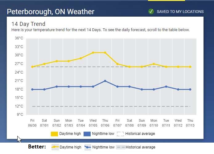
So The Weather Network plots an “historical average” on their 14-day trend chart. Which ius cool, since this gives some context. But I am suspect of the chart, since it appears the historical average high for the next 2 weeks is ~26C.
Also, the legend suggests the historical average is a box, not a line.
And while the yellow & blue blocks are fairly easy to figure out, using a coloured line and dot would be better.
And yes, this complaint puts solidifies my “old man yells at cloud” status.